
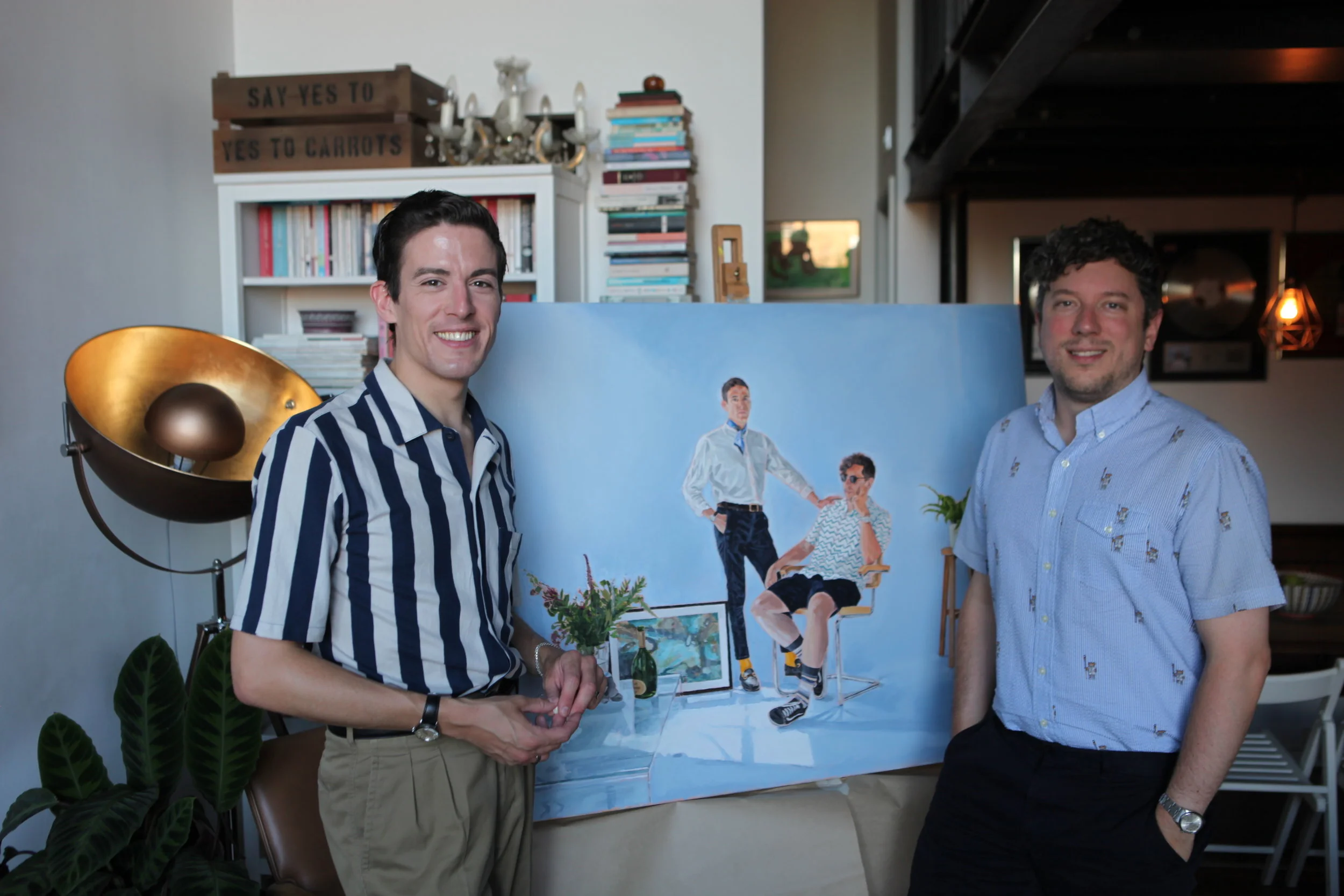
MR & MR ASPINALL AND HALLOWES UNVEILING
From an idea that in the back of a taxi cab in Puglia, Italy. To seeing an inspirational Hockney painting in the Tate Britain.
My newest portrait painting took over 2 years to complete.
1 photo shoot in East London
9-days of painting, totalling around 80 hours.
….and a total 8 poster studies, before starting work on the main canvas.
This investment of time was not what I originally planned, it grew organically this way. Put simply, it took that long to complete and fortunately I had the time to invest. The level of detailing in this picture is much higher than I tend to make naturally, but as a nod to the Hockey that it was inspired from – as this had a high level of realistic detailing to the people and the environment.
I had mentioned how the painting came about in a previous post but to re-cap. Several years before the painting even existed as an idea - we, myself and the portrait’s subjects had visited the Tate Britain and seen the giant David Hockney portrait – Mr & Mrs Clark; a tour de tour of neoclassical painting. This painting became the inspiration for their portrait’s composition and to a degree some of the themes. I wanted to keep the same casual seated pose of Mr Clark and even sourced the same Eames chair he sits in the 1970’s picture. And the standing pose of Mrs Percy Clark. But my painting had to have themes that were closer to a traditional wedding portrait, showing the pair as a happy couple. I did this primarily by having Christopher’s hand on Stephen’s shoulder, showing support and connection. I asked them both to wear whatever they felt like, as long as they matched and visually complemented one another. Further to this, they brought a selection of personal items to augment the scene. From a bunch of wedding flowers, a bottle of Champagne, and a cuddly toy sat on a glass table, to a painting by Stephen’s mother.
So, with the composition prescribed from the Hockney painting, as well as the symbolic objects in the scene. The next creative decision was the colour of the background. I originally intended the background to be a file of block colour and during the process, I had toyed with the idea of painting the room to a high level of detail, but the set on the photoshoot wasn’t dressed to paint directly. The white hanging sheets look scruffy and didn’t carry the regal air to the portrait; so block colour it had to be. I came to the decision of using a powder blue, which turned silvery with the strong light vistas coming in from the top right of the composition. And Blue has a good regal air too I thought. The underpainting of the background was a warm peach/orange tone, to give warmth to the skin tones, as well as a complementary to the powder blue top colour.
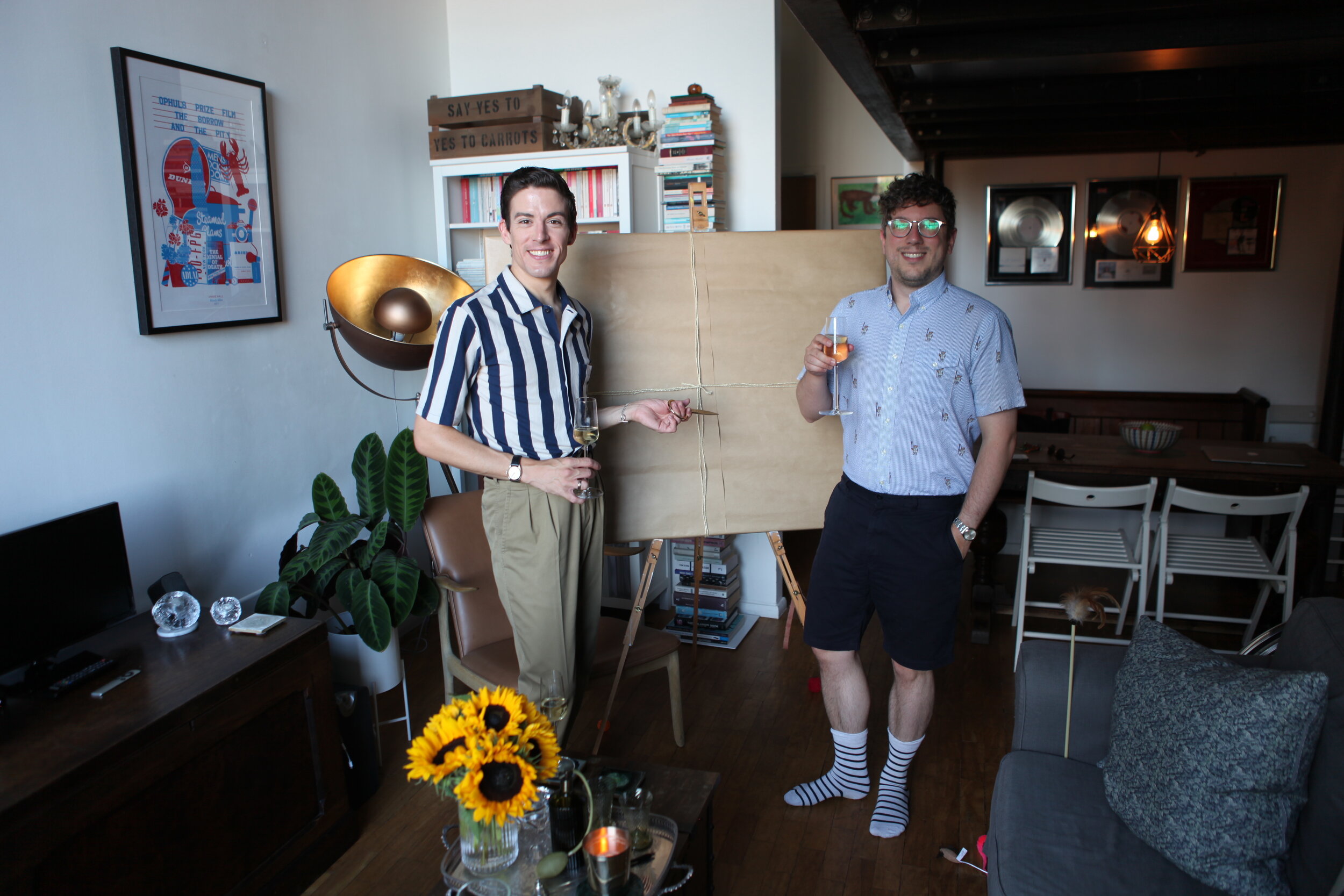
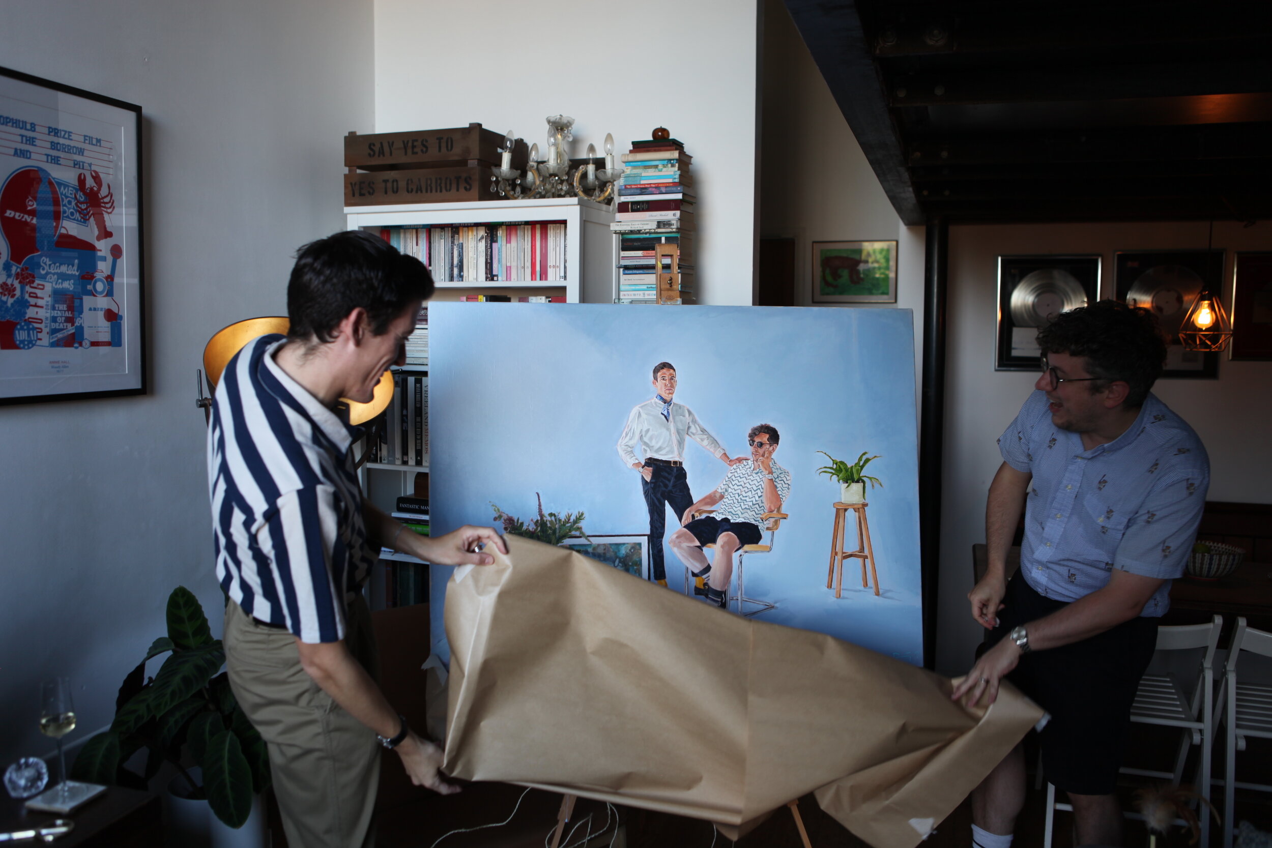
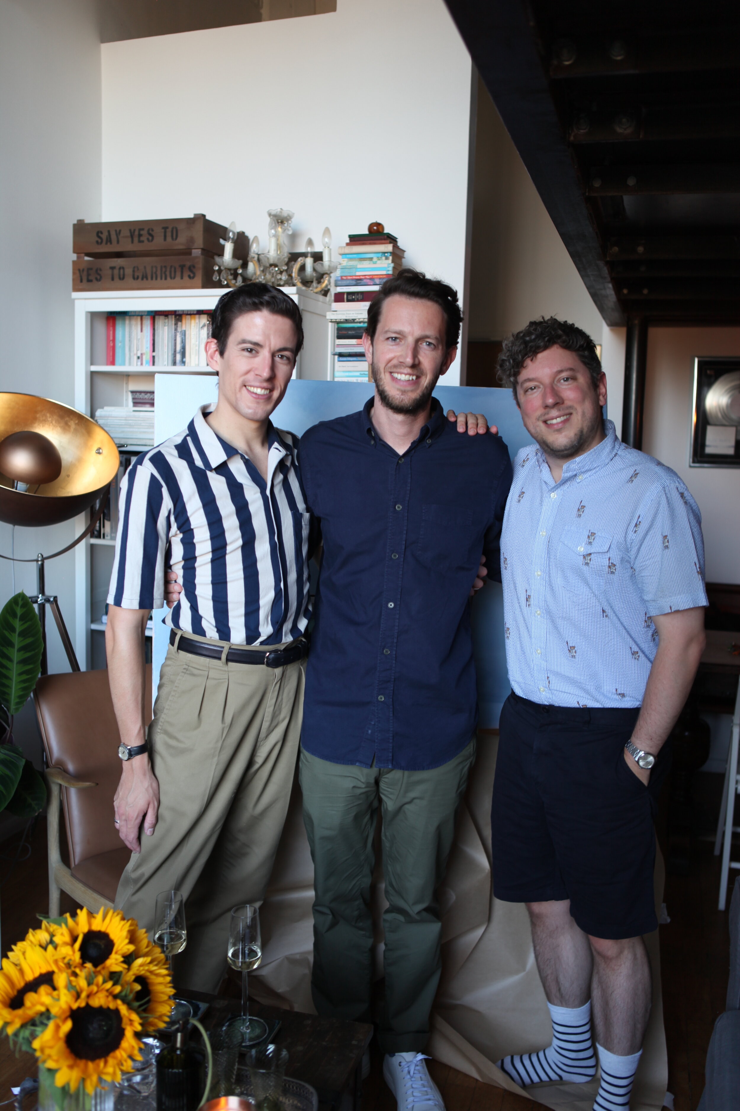
Here are a few pictures from the unveiling of the painting back in October 2019:

Latest & Greatest
Fresh Tweets
This is a block field
You can put any content in here.
Etiam porta sem malesuada magna mollis euismod. Vestibulum id ligula porta felis euismod semper. Maecenas sed diam eget risus varius blandit sit amet non magna. Vestibulum id ligula porta felis euismod semper.